import numpy as np
import pandas as pd

pd.set_option("display.max_rows", 12) # keep printed tables short in your own notebookModule 2
Introduction to Data Science
In this module, each week here mirrors the lecture for that week, but where the slides derive ideas by hand, this page lets you run them. To keep every example reproducible and free of downloading any files, we build small synthetic datasets in code at the top of each section. The numbers will not match any real-world file exactly, but the shapes of the data and every line of code are exactly what you would write against the real thing.
Week 2: Sampling and Probability
The Week 2 lecture argues that how you collect a sample decides whether you can trust anything you compute from it. The two ideas to hold onto are chance error (pure randomness, which averages out as the sample grows) and bias (a systematic lean in one direction, which does not average out). Code is the perfect place to see that difference instead of just being told it.
A reproducible random generator
Everything random in this course flows through one object, a NumPy generator. Seeding it means the same “random” draws come out every time, which is what makes a teaching page reproducible.
rng = np.random.default_rng(seed=42)
rng.integers(low=1, high=7, size=10)   # ten rolls of a fair die
array([1, 5, 4, 3, 3, 6, 1, 5, 2, 1])Sampling with and without replacement
A simple random sample draws without replacement: once an individual is picked, they are set aside. Sampling with replacement puts them back, so the same individual can appear twice. NumPy expresses the choice with a single keyword.
population = np.array(["Andrew", "Bella", "Dominic", "Elena", "Farid"])

without = rng.choice(population, size=3, replace=False)  # a simple random sample
with_rep = rng.choice(population, size=3, replace=True)  # with replacement
print("without replacement:", without)
print("with replacement:   ", with_rep)
without replacement: ['Bella' 'Elena' 'Farid']
with replacement: ['Elena' 'Dominic' 'Andrew']Chance error shrinks, bias does not
Here is the lecture’s central claim, made concrete. We have a population that is truly 60% “yes”. A fair sampling scheme draws uniformly at random. A biased scheme quietly over-selects the “yes” group, the way the 1936 Literary Digest frame over-selected wealthy voters. Watch what happens to each estimate as the sample grows.
population = np.array([1] * 6000 + [0] * 4000)  # 60% ones, the truth we want to recover
truth = population.mean()

def fair_estimate(n):
    sample = rng.choice(population, size=n, replace=True)  # uniform at random
    return sample.mean()

def biased_estimate(n):
    # Give the "yes" group twice the weight: a sampling frame that favors them.
    weights = np.where(population == 1, 2.0, 1.0)
    weights = weights / weights.sum()
    sample = rng.choice(population, size=n, replace=True, p=weights)
    return sample.mean()

rows = []
for n in [50, 500, 5000, 50000]:
    rows.append({
        "n": n,
        "fair": round(fair_estimate(n), 4),
        "biased": round(biased_estimate(n), 4),
    })
pd.DataFrame(rows)| n | fair | biased | |
|---|---|---|---|
| 0 | 50 | 0.560 | 0.8200 |
| 1 | 500 | 0.610 | 0.7460 |
| 2 | 5000 | 0.613 | 0.7608 |
| 3 | 50000 | 0.597 | 0.7508 |
Read the table down each column. The fair estimate wanders around the true 0.60 and visibly tightens onto it as n grows: that wandering is chance error, and it averages out. The biased estimate marches toward roughly 0.75 and stays there. A bigger biased sample does not get closer to the truth, it just gives you a wrong answer with more confidence. That is the whole warning of Week 2 in one table.
With replacement vs without, when the population is huge
The lecture claims that when the population is enormous compared to the sample, drawing with and without replacement give essentially the same probabilities. Let us check the exact example from the slides: 10,000 people, 7,500 of whom like Snack 1, draw 20, and ask for the chance that all 20 like Snack 1.
import math

N, likes_snack1, draws = 10000, 7500, 20

# Without replacement: the proportion shifts a little after each draw.
p_without = math.prod((likes_snack1 - i) / (N - i) for i in range(draws))

# With replacement: every draw is an independent 0.75.
p_with = 0.75 ** draws

print(f"without replacement: {p_without:.6f}")
print(f"with replacement:    {p_with:.6f}")
without replacement: 0.003151
with replacement: 0.003171Three decimal places of agreement. Removing 20 people from a pool of 10,000 barely moves the proportions, so each draw looks like an independent 0.75. The practical payoff is that the with-replacement numbers are far easier to compute, and we lean on that approximation constantly.
Binomial probability, by hand and by formula
When you sample with replacement a fixed number of times from a two-category population, the count in each category follows the binomial distribution. The lecture derived the probability of exactly 4 blue out of 7 draws from a 60%-blue bag. The formula counts the orderings, \(\binom{7}{4}\), times the probability of any one ordering, \((0.6)^4(0.4)^3\).
from math import comb

p_blue, n, k = 0.6, 7, 4
p_exact = comb(n, k) * (p_blue ** k) * ((1 - p_blue) ** (n - k))
print(f"P(exactly 4 blue of 7) = {p_exact:.6f}")
P(exactly 4 blue of 7) = 0.290304We can confirm that hand formula by simulating a million 7-draw experiments and counting how often exactly 4 come up blue. The simulated fraction should land right on the formula.
trials = rng.binomial(n=7, p=0.6, size=1_000_000)  # number of blues in each of a million draws
print(f"simulated fraction with exactly 4 blue: {(trials == 4).mean():.6f}")
simulated fraction with exactly 4 blue: 0.290452Multinomial probability
With more than two categories the same logic gives the multinomial probability: one factorial per category on top, one probability factor per category on the bottom. The slides worked out 4 blue, 2 green, 1 red from a bag that is 60/30/10.
counts = [4, 2, 1]
probs = [0.6, 0.3, 0.1]

coefficient = math.factorial(sum(counts)) / math.prod(math.factorial(c) for c in counts)
p_multi = coefficient * math.prod(p ** c for p, c in zip(probs, counts))
print(f"P(4 blue, 2 green, 1 red in 7 draws) = {p_multi:.6f}")
P(4 blue, 2 green, 1 red in 7 draws) = 0.122472And just like rng.binomial, NumPy can draw whole multinomial samples directly. Each row is one 7-draw experiment, and the three numbers in a row always sum to 7.
rng.multinomial(n=7, pvals=[0.6, 0.3, 0.1], size=8)array([[5, 0, 2],
[2, 4, 1],
[3, 4, 0],
[4, 3, 0],
[2, 3, 2],
[4, 1, 2],
[2, 5, 0],
[6, 1, 0]])
NoteWhy derive what a library computes for you?
You will never be asked to memorize these formulas. We work them out so that when you call rng.multinomial in a homework or see a probability in a real library, you know what it is computing and can sanity-check it by hand.
Week 3: Pandas
Week 3 moves one node down the data science lifecycle, from obtaining data to understanding it. The tool is pandas, and its central object is the DataFrame: a table with labeled rows and named columns. To practice without a download, we generate a synthetic baby-names dataset that has the same shape as the real Social Security file: a Year, a Sex, a Name, and a Count.
rng = np.random.default_rng(seed=7)

names_f = ["Mary", "Linda", "Susan", "Karen", "Lisa"]
names_m = ["James", "Robert", "John", "David", "Michael"]
records = []
for year in range(1950, 1965):
    for sex, pool in [("F", names_f), ("M", names_m)]:
        for name in pool:
            records.append({
                "Year": year,
                "Sex": sex,
                "Name": name,
                "Count": int(rng.integers(500, 5000)),
            })
babynames = pd.DataFrame(records)
babynames.head()| Year | Sex | Name | Count | |
|---|---|---|---|---|
| 0 | 1950 | F | Mary | 4752 |
| 1 | 1950 | F | Linda | 3312 |
| 2 | 1950 | F | Susan | 3578 |
| 3 | 1950 | F | Karen | 4537 |
| 4 | 1950 | F | Lisa | 3102 |
loc selects by label, iloc selects by position
This is the distinction that confuses every newcomer, so meet it head-on. loc selects by label and its slices are inclusive of the right endpoint. iloc selects by integer position and its slices are exclusive on the right, just like the plain Python slicing from Module 1.
babynames.loc[0:3, ["Name", "Count"]] # labels 0,1,2,3: four rows, right endpoint INCLUDED| Name | Count | |
|---|---|---|
| 0 | Mary | 4752 |
| 1 | Linda | 3312 |
| 2 | Susan | 3578 |
| 3 | Karen | 4537 |
babynames.iloc[0:3, [2, 3]] # positions 0,1,2: three rows, right endpoint EXCLUDED| Name | Count | |
|---|---|---|
| 0 | Mary | 4752 |
| 1 | Linda | 3312 |
| 2 | Susan | 3578 |
The same 0:3 means four rows under loc and three rows under iloc. When you only remember one thing: loc is inclusive, iloc is exclusive. Prefer loc in real code because labels survive sorting and filtering, while positions silently shift.
The square-bracket operator
Plain [] on a DataFrame is context-sensitive, which is convenient once it clicks. A single string pulls one column out as a Series (a one-dimensional labeled array). A list of strings pulls several columns and keeps them as a DataFrame.
col = babynames["Name"]          # a Series
print(type(col).__name__)
babynames[["Name", "Count"]].head() # a DataFrameSeries| Name | Count | |
|---|---|---|
| 0 | Mary | 4752 |
| 1 | Linda | 3312 |
| 2 | Susan | 3578 |
| 3 | Karen | 4537 |
| 4 | Lisa | 3102 |
Boolean indexing is the workhorse
You filter rows by handing [] a column of True/False values. Building that boolean column is where most of the thinking happens. The two rules that bite people: use & and | (not the words and/or), and wrap every condition in parentheses.
mary_rows = babynames["Name"] == "Mary"   # a boolean Series
babynames[mary_rows].head()| Year | Sex | Name | Count | |
|---|---|---|---|---|
| 0 | 1950 | F | Mary | 4752 |
| 10 | 1951 | F | Mary | 1782 |
| 20 | 1952 | F | Mary | 4174 |
| 30 | 1953 | F | Mary | 3121 |
| 40 | 1954 | F | Mary | 2598 |
# Two conditions: female AND a recent year. Note the parentheses around each.
babynames[(babynames["Sex"] == "F") & (babynames["Year"] >= 1960)].head()| Year | Sex | Name | Count | |
|---|---|---|---|---|
| 100 | 1960 | F | Mary | 3587 |
| 101 | 1960 | F | Linda | 2125 |
| 102 | 1960 | F | Susan | 3394 |
| 103 | 1960 | F | Karen | 3191 |
| 104 | 1960 | F | Lisa | 987 |
Three handy alternatives to long boolean chains. .isin tests membership in a list, the .str accessor runs string methods down a whole column, and .query lets you write the filter as a readable string.
babynames[babynames["Name"].isin(["Mary", "James"])].head(4)| Year | Sex | Name | Count | |
|---|---|---|---|---|
| 0 | 1950 | F | Mary | 4752 |
| 5 | 1950 | M | James | 3990 |
| 10 | 1951 | F | Mary | 1782 |
| 15 | 1951 | M | James | 4195 |
babynames[babynames["Name"].str.startswith("M")].head(4)| Year | Sex | Name | Count | |
|---|---|---|---|---|
| 0 | 1950 | F | Mary | 4752 |
| 9 | 1950 | M | Michael | 1850 |
| 10 | 1951 | F | Mary | 1782 |
| 19 | 1951 | M | Michael | 2605 |
babynames.query("Sex == 'F' and Year == 1960").head()| Year | Sex | Name | Count | |
|---|---|---|---|---|
| 100 | 1960 | F | Mary | 3587 |
| 101 | 1960 | F | Linda | 2125 |
| 102 | 1960 | F | Susan | 3394 |
| 103 | 1960 | F | Karen | 3191 |
| 104 | 1960 | F | Lisa | 987 |
Utility functions for a first look
When a dataset lands on your desk, a handful of methods tell you what you are holding. .shape and .size give dimensions, .describe summarizes the numeric columns, .sample shows random rows (more honest than .head, which only shows the top), and .value_counts / .unique profile a single column.
print("shape:", babynames.shape)   # (rows, columns)
print("size: ", babynames.size)    # total cells = rows * columns
babynames.describe()
shape: (150, 4)
size: 600| Year | Count | |
|---|---|---|
| count | 150.000000 | 150.000000 |
| mean | 1957.000000 | 2796.493333 |
| std | 4.334968 | 1288.410444 |
| min | 1950.000000 | 516.000000 |
| 25% | 1953.000000 | 1716.000000 |
| 50% | 1957.000000 | 2793.000000 |
| 75% | 1961.000000 | 3763.500000 |
| max | 1964.000000 | 4979.000000 |
babynames["Name"].value_counts().head()Name
Mary 15
Linda 15
Susan 15
Karen 15
Lisa 15
Name: count, dtype: int64babynames["Sex"].unique()<StringArray>
['F', 'M']
Length: 2, dtype: strSorting, including a custom key
.sort_values orders rows by a column. Pass ascending=False for largest-first, and a key= function for non-standard orders, such as sorting names by their length rather than alphabetically.
babynames.sort_values("Count", ascending=False).head()| Year | Sex | Name | Count | |
|---|---|---|---|---|
| 33 | 1953 | F | Karen | 4979 |
| 64 | 1956 | F | Lisa | 4969 |
| 26 | 1952 | M | Robert | 4957 |
| 39 | 1953 | M | Michael | 4950 |
| 117 | 1961 | M | John | 4904 |
# Sort the names by how many letters they have, shortest first.
babynames.sort_values("Name", key=lambda s: s.str.len()).head()| Year | Sex | Name | Count | |
|---|---|---|---|---|
| 0 | 1950 | F | Mary | 4752 |
| 4 | 1950 | F | Lisa | 3102 |
| 7 | 1950 | M | John | 1513 |
| 10 | 1951 | F | Mary | 1782 |
| 14 | 1951 | F | Lisa | 2749 |
Because each of these returns a new DataFrame, you can chain them left to right: filter, then sort, in one readable expression.
(babynames[babynames["Sex"] == "M"]
    .sort_values("Count", ascending=False)
.head())| Year | Sex | Name | Count | |
|---|---|---|---|---|
| 26 | 1952 | M | Robert | 4957 |
| 39 | 1953 | M | Michael | 4950 |
| 117 | 1961 | M | John | 4904 |
| 68 | 1956 | M | David | 4860 |
| 137 | 1963 | M | John | 4855 |
Groupby: split, apply, combine
The single most powerful pattern in pandas. .groupby splits the rows into groups, applies an aggregation to each, and combines the answers into one table. “Total babies per year” is a group-by-year then sum.
babynames.groupby("Year")["Count"].sum().head()Year
1950 31634
1951 27102
1952 28089
1953 36016
1954 22076
Name: Count, dtype: int64Group by more than one column to get a finer breakdown, and use .agg to compute several summaries at once.
babynames.groupby(["Year", "Sex"]).agg(
    total=("Count", "sum"),
    n_names=("Name", "count"),
).head()| total | n_names | ||
|---|---|---|---|
| Year | Sex | ||
| 1950 | F | 19281 | 5 |
| M | 12353 | 5 | |
| 1951 | F | 14090 | 5 |
| M | 13012 | 5 | |
| 1952 | F | 13563 | 5 |
Pivot tables reshape a grouping
A pivot table takes one grouping variable onto the rows and another onto the columns, which is exactly the shape you want when comparing two categories side by side, such as female versus male totals per year.
babynames.pivot_table(
    values="Count", index="Year", columns="Sex", aggfunc="sum"
).head()| Sex | F | M |
|---|---|---|
| Year | ||
| 1950 | 19281 | 12353 |
| 1951 | 14090 | 13012 |
| 1952 | 13563 | 14526 |
| 1953 | 18016 | 18000 |
| 1954 | 13946 | 8130 |
Merging two tables
Real data is spread across files linked by a key. pd.merge joins them. An inner join keeps only keys present in both tables, while an outer join keeps every key and fills the gaps with NaN. Here we attach a small table of regional info by Sex just to show the mechanics.
extra = pd.DataFrame({"Sex": ["F", "M"], "label": ["female", "male"]})
pd.merge(babynames, extra, on="Sex", how="inner").head()| Year | Sex | Name | Count | label | |
|---|---|---|---|---|---|
| 0 | 1950 | F | Mary | 4752 | female |
| 1 | 1950 | F | Linda | 3312 | female |
| 2 | 1950 | F | Susan | 3578 | female |
| 3 | 1950 | F | Karen | 4537 | female |
| 4 | 1950 | F | Lisa | 3102 | female |
Week 4: Data Wrangling, EDA, and Regular Expressions
Week 4 sits on the messy reality that you spend most of your time cleaning data, not modeling it. The lecture frames any new dataset through five properties (structure, granularity, scope, temporality, faithfulness) and gives you the tools to clean text. We will focus on the two parts that are pure code: handling missing values, and using regular expressions.
Storage type is not feature type
The lecture’s sharpest warning: how pandas stores a column (int64, object, float64) is not the same as what the column means. A ZIP code stored as a number is not a quantity, it is a nominal label, and averaging it would be nonsense. Always look at the dtypes, then think about meaning separately.
people = pd.DataFrame({
    "zip": [78228, 10001, 94720],     # stored as int, but it is a nominal label
    "age": [19, 23, 21],              # stored as int, and genuinely a quantity
    "city": ["San Antonio", "New York", "Berkeley"],
})
people.dtypes
zip int64
age int64
city str
dtype: objectMissing data and sentinel values
Missing values hide in two forms: an explicit NaN, or a sentinel such as -99.99 or 999 that some instrument writes when it has no real reading. The dangerous one is the sentinel, because pandas will happily average it as if it were data. We build a synthetic monthly CO2 series in the spirit of the Mauna Loa dataset, complete with a -99.99 sentinel, and clean it three ways.
rng = np.random.default_rng(seed=1)
months = pd.date_range("2020-01-01", periods=24, freq="MS")
co2 = 410 + np.arange(24) * 0.15 + rng.normal(0, 0.3, 24)  # a gentle upward trend
co2[5] = -99.99   # the instrument failed in month 5 and wrote its sentinel
co2[14] = -99.99  # and again in month 14

co2_df = pd.DataFrame({"month": months, "co2": co2.round(2)})
co2_df.head(7)| month | co2 | |
|---|---|---|
| 0 | 2020-01-01 | 410.10 |
| 1 | 2020-02-01 | 410.40 |
| 2 | 2020-03-01 | 410.40 |
| 3 | 2020-04-01 | 410.06 |
| 4 | 2020-05-01 | 410.87 |
| 5 | 2020-06-01 | -99.99 |
| 6 | 2020-07-01 | 410.74 |
Step one is always to turn the sentinel into an honest NaN so nothing downstream mistakes it for a reading.
co2_df["co2"] = co2_df["co2"].replace(-99.99, np.nan)
print("missing values:", co2_df["co2"].isna().sum())
missing values: 2Now you have a real choice. Drop the missing rows (simple, but it leaves gaps in a time series), or interpolate to fill each gap from its neighbors (natural for smoothly varying measurements like CO2). The lecture’s point is that the right choice depends on what the data means.
dropped = co2_df.dropna(subset=["co2"])
filled = co2_df.copy()
filled["co2"] = filled["co2"].interpolate()

print("rows after dropping:", len(dropped))
print("rows after filling: ", len(filled))
filled.loc[4:6, :]   # the gap at month 5 is now bridged by its neighbors
rows after dropping: 22
rows after filling: 24| month | co2 | |
|---|---|---|
| 4 | 2020-05-01 | 410.870 |
| 5 | 2020-06-01 | 410.805 |
| 6 | 2020-07-01 | 410.740 |
Canonicalizing text
The same real-world thing often appears in many written forms: different capitalization, stray whitespace, “St.” versus “Saint”. Canonicalization maps all of them to one standard form so that grouping and joining actually work. The pandas .str accessor applies an ordinary string method down a whole column.
cities = pd.Series(["  San Antonio ", "SAN antonio", "San   Antonio"])
clean = (cities
    .str.strip()                      # trim outer whitespace
    .str.lower()                      # unify capitalization
    .str.replace(r"\s+", " ", regex=True))  # collapse runs of spaces to one
clean
0 san antonio
1 san antonio
2 san antonio
dtype: strAfter cleaning, all three strings are identical, so they will group together. Before cleaning, pandas would have treated them as three different cities.
Regular expressions
A regular expression is a tiny pattern language for searching and extracting inside text, far more flexible than fixed string methods. Python’s re module is the foundation, and pandas exposes the same engine through .str. Always write patterns as raw strings with an r prefix so backslashes mean what you intend.
The core pieces: \d is a digit, \w a word character, \s whitespace, . any character, + means “one or more”, * means “zero or more”, {n} means “exactly n”, and parentheses ( ) create a capture group that you can pull back out.
import re

text = "Contact 210-555-0148 or 512-555-0199 before noon."
phone = r"\d{3}-\d{3}-\d{4}"   # three digits, dash, three, dash, four

print(re.findall(phone, text))      # every match in the string
print(re.search(phone, text).group())  # just the first match
['210-555-0148', '512-555-0199']
210-555-0148re.sub replaces every match, which is how you strip unwanted patterns such as HTML tags out of scraped text.
html = "<p>Hello <b>world</b></p>"
print(re.sub(r"<[^>]+>", "", html))   # delete anything that looks like a tag
Hello worldCapture groups turn matching into extraction. Parenthesize the parts you want, and each match comes back split into those pieces. Here we pull the area code and the line out of each phone number.
re.findall(r"(\d{3})-(\d{3}-\d{4})", text) # a list of (area_code, rest) tuples[('210', '555-0148'), ('512', '555-0199')]Regex inside pandas
The real reason to learn this is to run it over a whole column. .str.contains filters rows whose text matches a pattern, and .str.extract pulls capture groups into brand new columns, which is the bread and butter of feature creation from messy text.
logs = pd.Series([
    "user=ada action=login ip=10.0.0.1",
    "user=babbage action=logout ip=10.0.0.7",
    "user=curie action=login ip=10.0.0.3",
])

# Keep only the login events.
logins = logs[logs.str.contains(r"action=login")]
print(logins.tolist())
['user=ada action=login ip=10.0.0.1', 'user=curie action=login ip=10.0.0.3']# Extract the username and IP from each line into two clean columns.
logs.str.extract(r"user=(\w+) action=\w+ ip=([\d.]+)")| 0 | 1 | |
|---|---|---|
| 0 | ada | 10.0.0.1 |
| 1 | babbage | 10.0.0.7 |
| 2 | curie | 10.0.0.3 |
WarningWhat regex cannot do
Regular expressions are perfect for flat, line-oriented text, but they cannot parse nested structures. Do not try to parse JSON or HTML trees with a regex. Use json.load or a real HTML parser for those. Regex is for extraction and cleaning, not for hierarchy.
Week 5: Visualization
Week 5 is about seeing data. A good plot reveals shape, spread, and relationships that no table of numbers makes obvious. We use seaborn and matplotlib for static plots and plotly for interactive ones. To have something meaningful to plot, we build a synthetic births dataset with a real effect deliberately baked in: babies of smokers weigh a little less, exactly the pattern the lecture’s real dataset shows.
import matplotlib.pyplot as plt
import seaborn as sns

sns.set_theme(style="whitegrid")  # a clean default look for every plot below

rng = np.random.default_rng(seed=5)
n = 800
smoker = rng.choice([True, False], size=n, p=[0.4, 0.6])
maternal_height = rng.normal(64, 2.5, n)                      # inches
birth_weight = (
    120                                  # baseline in ounces
    + (maternal_height - 64) * 1.2       # taller mothers, slightly heavier babies
    - smoker * 9                         # the smoking effect: about 9 ounces lighter
    + rng.normal(0, 16, n)               # natural variation
)
births = pd.DataFrame({
    "Birth Weight": birth_weight.round(1),
    "Maternal Height": maternal_height.round(1),
    "Maternal Smoker": smoker,
})
births.head()| Birth Weight | Maternal Height | Maternal Smoker | |
|---|---|---|---|
| 0 | 96.4 | 63.3 | False |
| 1 | 134.5 | 67.4 | False |
| 2 | 124.5 | 61.4 | False |
| 3 | 106.2 | 60.1 | True |
| 4 | 102.8 | 67.5 | True |
Counting a category
For a categorical column, the first question is simply “how many of each?” A count plot answers it visually, the chart equivalent of value_counts.
sns.countplot(data=births, x="Maternal Smoker")
plt.title("Number of smoking vs non-smoking mothers")
plt.show()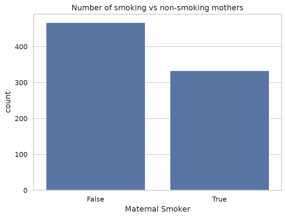
Histograms and the KDE
For a continuous column we cannot count every distinct value, so we bin it: a histogram chops the range into bars. Overlaying a kernel density estimate (kde=True) draws a smooth curve that does not depend on where the bin edges happen to fall, which is often a fairer picture of the underlying shape.
sns.histplot(data=births, x="Birth Weight", kde=True)
plt.title("Distribution of birth weight")
plt.show()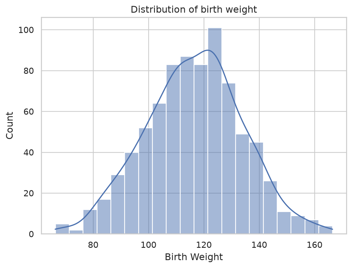
The KDE works by placing a small bump (a kernel) over every data point and adding them up. A rug plot draws the raw points as ticks along the axis, which makes that “one bump per point” idea visible underneath the smooth curve.
sns.histplot(data=births, x="Maternal Height", kde=True, stat="density")
sns.rugplot(data=births, x="Maternal Height", color="red", height=0.05)
plt.title("Maternal height, with a rug of the raw observations")
plt.show()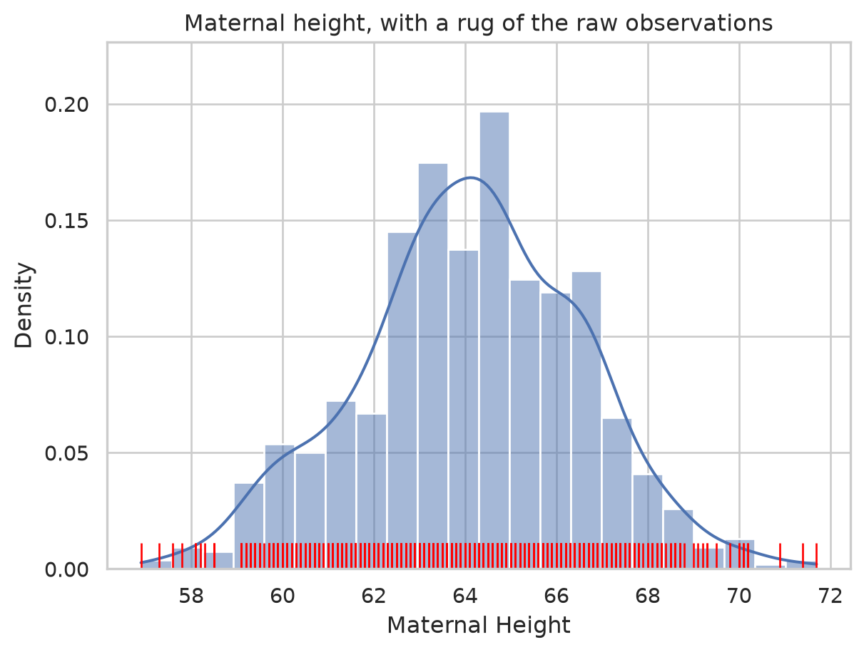
Box and violin plots compare groups
The real question is whether smokers’ babies weigh less. To compare a numeric variable across a category, a box plot summarizes each group by its quartiles: the box spans the middle 50% (Q1 to Q3, the interquartile range), the line inside is the median, and points beyond the whiskers are potential outliers.
sns.boxplot(data=births, x="Maternal Smoker", y="Birth Weight")
plt.title("Birth weight by smoking status")
plt.show()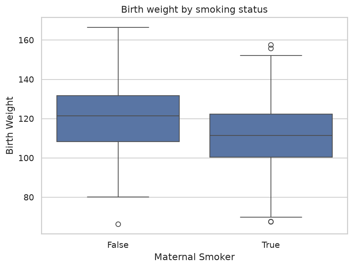
A violin plot carries the same quartile information but replaces the plain box with a mirrored density curve, so a wide bulge means many babies at that weight. You can see both the summary and the full shape at once.
sns.violinplot(data=births, x="Maternal Smoker", y="Birth Weight")
plt.title("Same comparison, now showing the full distribution shape")
plt.show()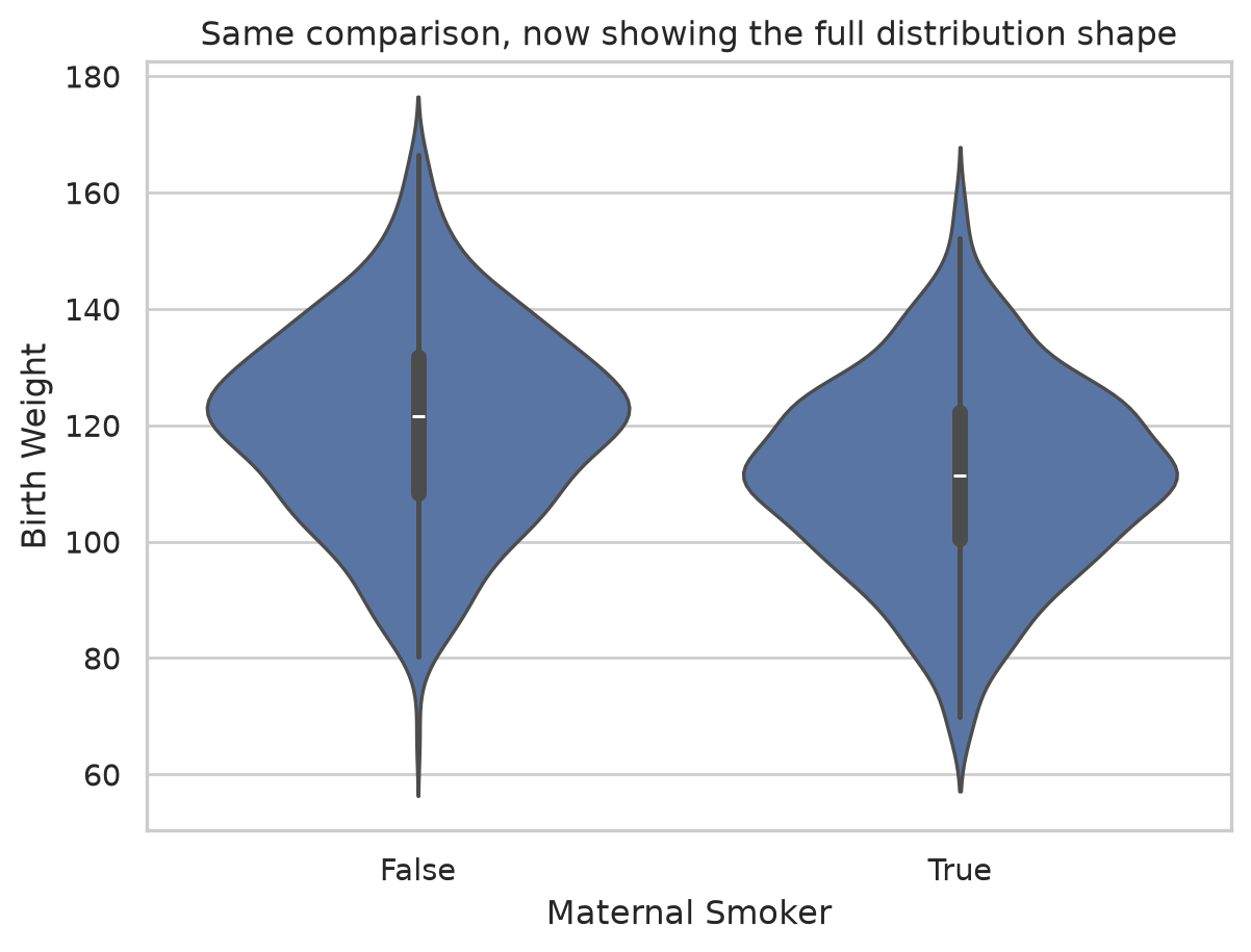
Both plots tell the same story: the smoker box and violin sit visibly lower. The effect we baked into the data is plainly there, which is the point of a good comparison plot.
Scatter plots reveal relationships
To see how two numeric variables move together, scatter them. A clear upward drift means taller mothers tend to have heavier babies. sns.lmplot adds a fitted line so the trend is unmistakable.
plt.scatter(births["Maternal Height"], births["Birth Weight"], alpha=0.4)
plt.xlabel("Maternal Height (inches)")
plt.ylabel("Birth Weight (ounces)")
plt.title("Do taller mothers have heavier babies?")
plt.show()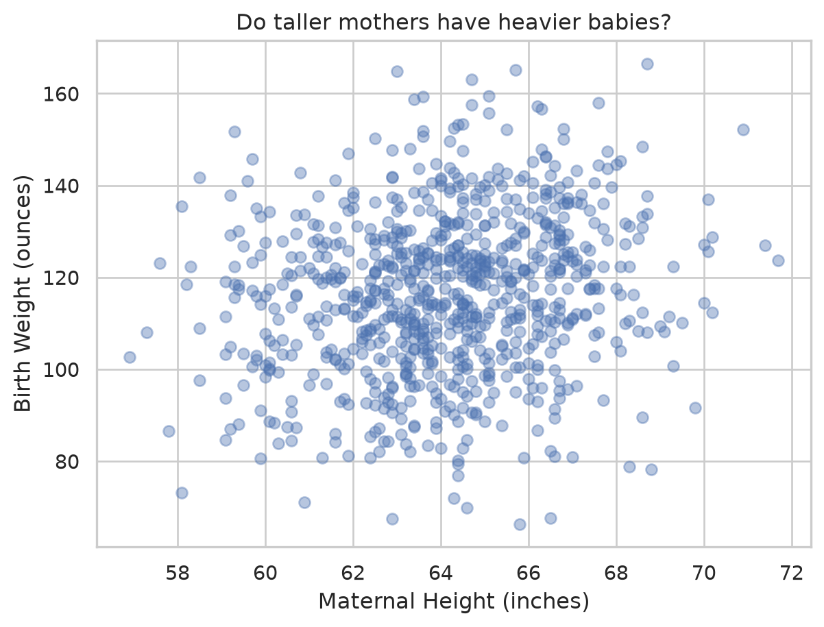
sns.lmplot(data=births, x="Maternal Height", y="Birth Weight", ci=None,
           scatter_kws={"alpha": 0.3})
plt.title("Same scatter with a fitted trend line")
plt.show()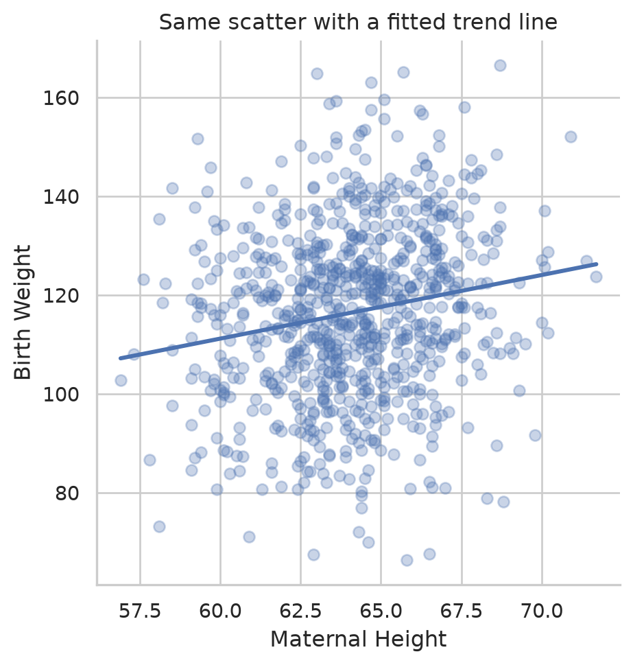
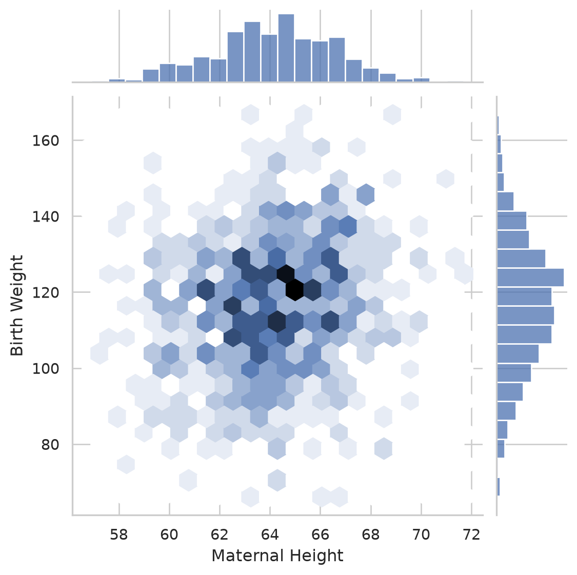
A joint plot combines the scatter with each variable’s own distribution along the margins. The kind="hex" version bins the points into hexagons, which reads more clearly than overlapping dots when you have a lot of data.
sns.jointplot(data=births, x="Maternal Height", y="Birth Weight", kind="hex")
plt.show()