Module 1

Introduction and Background

Author

Yike Zhang

Published

August 21, 2025

Class Activities

Week 1

Example: Iris Dataset Visualization

This example demonstrates how to visualize the Iris dataset using a scatter plot. The Iris dataset is a classic dataset in machine learning, containing measurements of iris flowers from three different species. The example is adapted from the sklearn documentation.

from sklearn import datasets
import matplotlib.pyplot as plt

iris = datasets.load_iris()
_, ax = plt.subplots()
scatter = ax.scatter(iris.data[:, 0], iris.data[:, 1], c=iris.target)
ax.set(xlabel=iris.feature_names[0], ylabel=iris.feature_names[1])
_ = ax.legend(scatter.legend_elements()[0], iris.target_names, loc="lower right", title="Classes")
ax.set_ylim(2.0, 4.5)
plt.show()

Separating the setosa class with other classes using a separator line. Below is an example of adding the divider to the scatter plot.

from sklearn import datasets
import numpy as np
import matplotlib.pyplot as plt

iris = datasets.load_iris()
_, ax = plt.subplots()
scatter = ax.scatter(iris.data[:, 0], iris.data[:, 1], c=iris.target)
ax.set(xlabel=iris.feature_names[0], ylabel=iris.feature_names[1])
_ = ax.legend(scatter.legend_elements()[0], iris.target_names, loc="lower right", title="Classes")
# Adding a separator line
m = 1  # slope
b = 2.3   # intercept

# x range based on current plot limits
x_vals = np.linspace(*ax.get_xlim(), 100)
y_vals = m * x_vals - b

ax.plot(x_vals, y_vals, 'r--', label="Separator: y = x - {:.1f}".format(b))
ax.legend()

ax.set_ylim(2.0, 4.5)

plt.show()

Weekly Step Count Analysis

Our goal is to identify the most active walking days of each week. The code below shows how to visualize the step counts for two weeks using basic data visualization techniques (line chart and bar chart). This example is adapted from The Python Coding Book.

import matplotlib.pyplot as plt

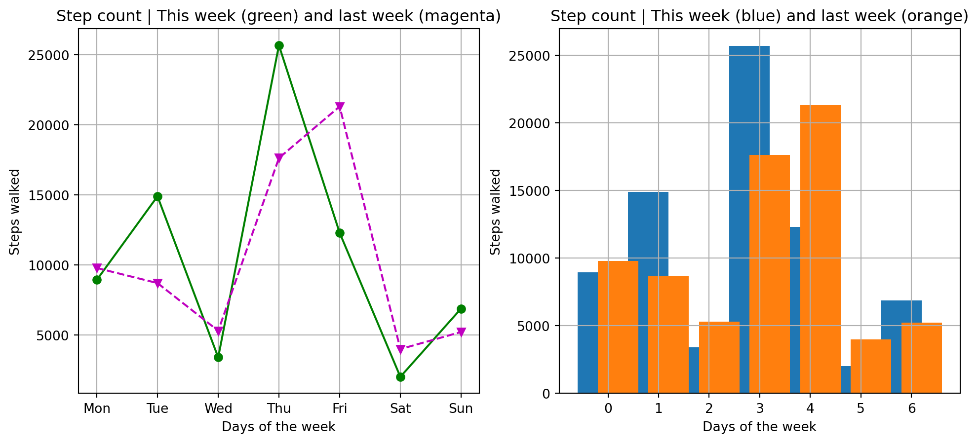
days = ["Mon", "Tue", "Wed", "Thu", "Fri", "Sat", "Sun"]
steps_walked = [8934, 14902, 3409, 25672, 12300, 2023, 6890]
steps_last_week = [9788, 8710, 5308, 17630, 21309, 4002, 5223]

fig, axs = plt.subplots(1, 2, figsize=(12, 5))

# Plot line chart
axs[0].plot(days, steps_walked, "o-g")
axs[0].plot(days, steps_last_week, "v--m")
axs[0].set_title("Step count | This week (green) and last week (magenta)")
axs[0].set_xlabel("Days of the week")
axs[0].set_ylabel("Steps walked")
axs[0].grid(True)

# Plot bar chart
x_range_current = [-0.2, 0.8, 1.8, 2.8, 3.8, 4.8, 5.8]
x_range_previous = [0.2, 1.2, 2.2, 3.2, 4.2, 5.2, 6.2]

axs[1].bar(x_range_current, steps_walked)
axs[1].bar(x_range_previous, steps_last_week)
axs[1].set_title("Step count | This week (blue) and last week (orange)")
axs[1].set_xlabel("Days of the week")
axs[1].set_ylabel("Steps walked")
axs[1].grid(True)

plt.show()